Error messages are part of the software products, apps, and websites.
Can any software program be designed in the way that do not cause any errors? Hence, there is no error message at all. The error means hiccups to proceed ahead. This annoys users.
No, it is almost impossible. Because every software, app, or website is developed in certain programming languages that have certain compatibility.
However, users need not be concerned about such things. When they interact with the websites, app, or software, and they enter data in the format the software program does not accept, error messages appear. For technical communicators, best practices for writing perfect error messages should be to write solution-oriented error messages.
Why do Error Messages Appear?
Error messages may appear because of the following reasons.
- The entered data is not in the required format for the software or app.
- The Internet is not available.
- The server could not be connected or the server may be down.
1. The entered data is not in the required format for the software or app
When users enter data to complete some action or settings, they are clueless about the format of the data. They tend to enter the data in the way they are more familiar and they cannot predict uncalled errors. Vague error messages will make their life even more measurable.

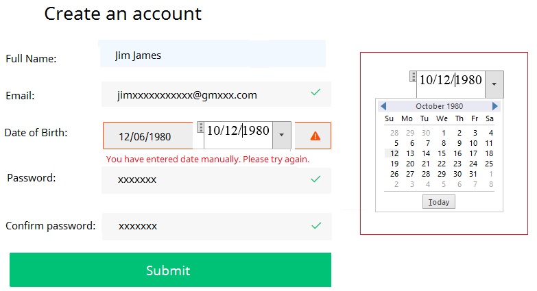
In this example, a Datepicker is being used to enter the date of birth. When the date was entered directly without using the Datapicker, the error “You have entered date manually. Please try again.” appeared.
This is an example of bad error text message. This error simply tells why the error occurred, but does not suggest how it can be resolved.
The better user-friendly message could be like;
Wrong date format. Use Datepicker to enter the date.
This error is talking about why the errors occurred and how the issue can be resolved.
2. The Internet is not available
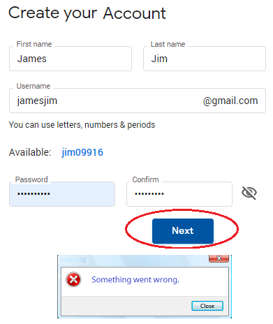
Here is another example of creating an account with a web portal.

After filling all the information, when the Next button is clicked, an error message “Something went wrong.” appeared.
This is completely a vague description of the error. It does not show why the error occurred and how it can be resolved.
This error may be appearing either because the Internet is not available or the server could not be reached.
If Internet connection is not available, the error message should read like;
“No Internet. Check your Internet connection and retry.”
3. The server could not be connected or the server may be down
In the same example as given above, the error could appear when the server could not be connected.
If the server is down, the error message should read like;
“It seems the server could not be connected. Please try again after sometime.”
Or
“The server seems to be down currently. Retry after sometime or contact our support if the issue persists.”
Write Messages that Recommend Data Format
The biggest challenge should be how to reduce the possibility of errors committed by the users. For each action, the message should be solution oriented and not issue oriented.
I think that where users are required to enter data, they must be recommended what to enter and how. This approach will help users easily enter the require information in the first attempt. If the users do not commit errors, no error messages will pop up.
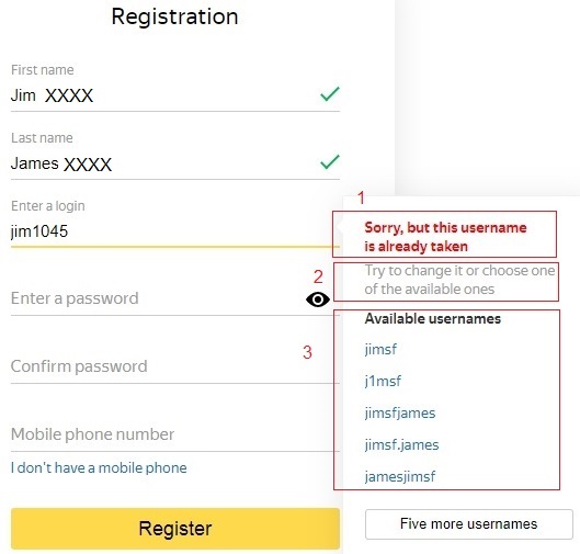
One of the best examples of how to help users to enter the data in the exact format the software accepts is that of the Yandex search engine.
While entering information on the Registration form, it shows helpful messages for each field.

- Shows what the error is about. In this case the error message reads like “Sorry, this username is already taken.
- Recommends the solution. The solution is clear “Try to change it or choose one of the available ones.”
- Provides readily available options. Users can choose one of the available usernames if they are not bothered to create a unique one.
To design such user interface (UI) experience, the software needs not only to include logics and validation for the entered data but also it must display messages for each field.

